Minna Sakaria on Queertype and finding herself
After training in both art and advertising, Minna Sakaria, graphic designer and commercial artist, discovered a love of typography. Her commercial work and private projects are deeply rooted in queer theory. When we met, she told me that the word “stereotype” is derived from 18th century typographic tradition. It referred to printing with a solid cast plate instead of using movable type, and the result was exactly the same print every time. In this context, Minna Sakaria’s project “Queertype” is at once a social project, an exercise in innovative typography and a breath of fresh air in visual communication…
The first thing we discussed was critical design and what the term means to someone in a designer’s role. What does critical design mean?
Critical graphic design, or critical design, is a term that is frequently discussed in academic design contexts. A buzzword, the meaning of which can be somewhat difficult to understand. It’s not really that strange, but it took me five years of training to understand what it meant. Dunne and Raby are London-based product designers and their definition is so amazingly simple: “Its opposite is affirmative design: design that reinforces the status quo.” There’s design that consists of following the beaten path. But design that sells because it’s something that people are used to seeing, that’s something else for me. Like reproduction. I want to beat a new path. Once I had grasped that, I realised that this was the reason I’d wanted to do design in the first place.
So that was exactly how you’d seen the role of a designer the entire time?
Yes, exactly, but I had a long road to travel before I got to practise that role. A road that consisted of finding intellectual terms for things that I understood instinctively from the start!
When I was studying, I really wanted a concrete example of what critical design is, but it wasn’t always that clear. I wanted to see a project I could point at and say, “That right there is critical; I understand that because it does something…?” I hardly even knew what questions to ask. Perhaps that was where the Queertype project came from: the realisation that “this is something I myself could call critical design” because it’s trying to do something different. Not just reproduce the same ideal.
Do you think that designers have a responsibility to be critical designers?
It’s really much simpler than that. It’s not as if there’s some cumbersome requirement that needs to be imposed on designers. I don’t think it should even be necessary to say critical design, because design IS critical. Instead of differentiating between design and critical design, we could differentiate between design and affirmative design instead.
You began by studying art, didn’t you?
First I studied at Munka Art School, but I dropped out after a year and a half because I didn’t feel entirely at home in the art world. Then I tried out freelancing for a while until I decided I wanted to be a graphic designer after all. Then I carried on living in Lund and didn’t do as much research as I perhaps should have done. I ended up at Forsbergs, but it quickly became obvious that I wasn’t going to get on there either. I felt that we were expected to work a certain way and with a certain attitude without thinking much about why. Of course I wondered why, what is the knowledge behind it, what are the conventions founded in? I felt like I couldn’t work a certain way unless I understood why.
A teacher at Forsbergs recommended Konstfack and their graphic design and illustration course. I was lucky enough to get in, and I got to learn loads of great stuff – obviously better conditions to study in. After getting my degree, I applied for a master’s in Visual Communication at the Royal College of Art in London. I wanted to learn more, and to get perspective on my experience at Konstfack. The RCA was the right place for that. Although people still come from the same socio-economic background as they do at home, but there’s a lot of other things there that require all your learning capacity and social skills.
The Queertype project began with Minna Sakaria’s master’s thesis, which she wrote on script typefaces (typefaces that imitate the movement of the hand).
Script typefaces often have a bad reputation. They’re not typefaces that a respectable graphic designer would generally use. I wanted to investigate what was wrong with that physical, human imprint, and why the more rational sans serif typefaces were more highly valued. I also wondered whether script typefaces were used in communication directed at women and sans serifs in communication to men. Look at Diet Coke and Coca-Cola Zero. Diet Coke, which came first and is set in a script typeface, didn’t sell with men. Zero, which is the same kind of product but designed to reach a male target group, was set in a sans serif typeface.
I wanted to investigate what was wrong with that physical, human imprint, and why the more rational sans serif typefaces were more highly valued.
That phenomenon turned out to be true of other brands. I carried out a load of investigations, including in a large clothing chain and their children’s T-shirts for boys and girls. It was true for ALL the T-shirts. So can you say that a typeface is feminine or masculine?
I thought a lot about that, and I consulted Judith Butler’s texts for clarification. Since it hasn’t always been that way, I wondered when script typefaces became feminine, and what part we as visual communicators play in carrying it forward. Butler talks about performative gender, that we perform gender roles but they don’t actually exist. Certain institutions in society confirm those roles, and then I realised that I’m part of one of those institutions. As a visual communicator, I confirm what is just abstract performance. By reproducing aesthetics or typefaces as feminine vs. masculine, I’m playing a part in creating gender.
It was interesting to bring typography together with queer theory, and I really wanted to find a way to use the research to make a project. I was also interested in designing typefaces, so I made a sans serif and a script typeface. My script typeface doesn’t look like a classic script typeface in any way, but in the end I felt that it wasn’t about appearance as much as it was about decoration or lack of decoration. I looked a lot at contemporary decoration in emojis and digital girl culture as a visual reference. So the typeface itself isn’t queer as such. It’s more that they allude to stereotypes. But letters aren’t just shapes; they also contain a linguistic message. Queer Type (in contrast to Stereotype) emerges when you exchange the visual and linguistic messages.

So Queertype is a combination of the typefaces you created and the message.
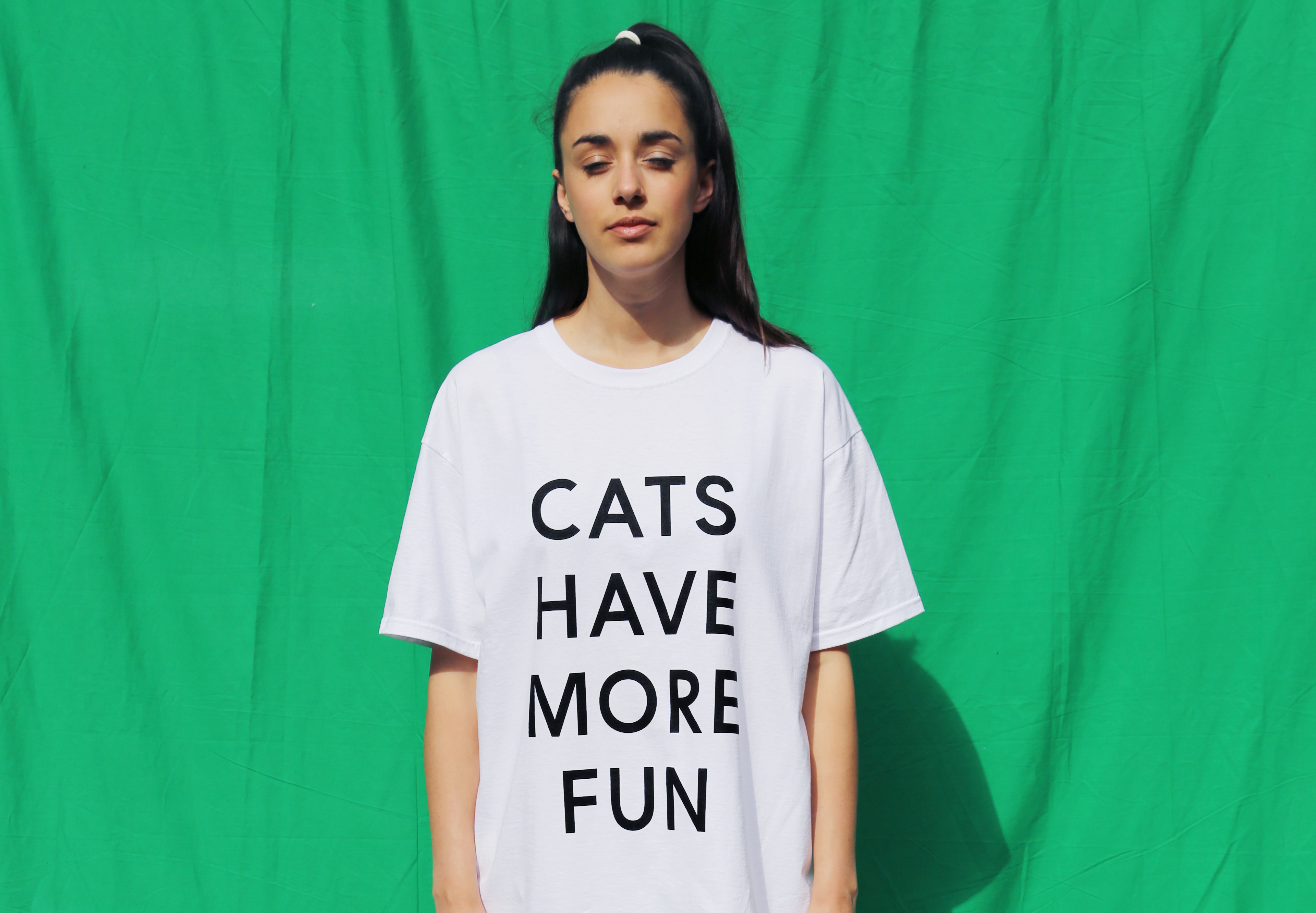
Yes, exactly. I used the texts from the T-shirts I researched. Examples of texts I found on T-shirts for guys include “Trouble is my middle name” and “I will never grow up”, while the corresponding communication for girls was “I wear flowers” and “Cats have more fun”. With an inverted visual language on these texts, the sum total communication becomes, not redundant, but queer instead.
I understand that it was difficult to stay at Forsbergs. After all, the whole advertising world is about manifesting norms that are already established.
Yes, there’s a reason why clothing chains write “I wear flowers” on girls’ T-shirts and “I will never grow up” on T-shirts for boys. Those norms sell. They earn twice as much by having two genders. An example of patriarchy and capitalism in perfect symbiosis.
Do you criticise the one system by working from within the other?
Yes, sort of. For me it’s often about not questioning everything at once, but maintaining some recognisable point in order to get through to people. Since my T-shirts have sold well, I can prove that there is commercial space for a kind of non-binary and unclear communication. That means that there could potentially be interest in putting these shirts into production with a clothing chain similar to the one I found the originals at. If that happens, a patriarchal norm will also have been changed. Even if it’s within capitalist principles.
We talked about how it was in London that you were able to identify your role as a commercial artist.
Graphic design also involves a certain amount of marketing, and of course it has its origins there. It’s impossible not to talk about commercialism and graphic design in the same sentence. Studying in London taught me critical design, while a discussion of commercial perspectives was never far away. It gave me more space to act, and more motivation to do the T-shirt project.
You told me that the democratic aspect is something that attracts you to being commercial. Printing posters that many people can have, that is.
There was a teacher at Konstfack who said that when we studied copperplate. She said it was a kind of democratic art, since it means that 30 people can buy for a bit less money than a rich person can. That it can get out there. I like that idea.
Minna Sakaria is one half of Summer Studio, a recently launched graphic design agency. Summer Studio does commercial jobs while also running its own projects on the side. They are currently preparing the release of their website and planning a trip to Seoul in November, where they will take part in the typography bienniale Typojanchi 2015. Check out Queertype on Instagram!